Symptom Checker
Arvic's Symptom Checker module is a comprehensive tool designed to help users get information about their symptoms of sickness. It leverages computerized algorithms to ask users a series of questions about their symptoms, as well as personal information such as age, height, weight, and underlying diseases, to provide accurate results. The Symptom Checker was developed in collaboration with Cariva and medical consultants, to ensure the tool is reliable and effective.
Overview
Business Goals
-
To gather a large amount of user's symptom data in order to build an Artificial Intelligence (AI.) predictive model.
-
Symptom checker aims to be part of Arvic service.
Issues
-
Over ton of health-related searches were made. The trouble is, if users search, for example, ‘Headaches’ into Google, they’ll get nearly 3 million returning results. They may feel overloaded.
Key Tasks
-
Business requirement gathering, Stakeholder interview
-
Competitor Analysis
-
Information Architecture,
-
Wire-framing, Lo-fi and Hi-fi prototyping,
-
Interactive prototyping
-
Usability testing
Information Architecture
It is undeniable true that a symptom checker requires extensive medical knowledge. To offer the market a dependable and unparalleled symptom checker, we have established this project in collaboration with our physician and medical consultants. It all begins with the concept of "Chief Complaints". This refers to the symptoms that patients frequently report to their doctor, which allows for a more focused evaluation and improved disease diagnosis. The accompanying diagrams show how all potential chief complaints are categorised into various body areas, based on the user's perception when describing their symptoms.
User Flow 1 : with Severity Classification

The next process is about user journey. For the first flow with severity classification, there are 6 different stages. For details, users need to give us a personal information regarding name, age, gender and all related info. The next step is that user will be able to choose what symptom they have, based on provided chief complaints. Then, this flow requires user to input a duration of their symptom because the checklists will be classified by severity levels including acute and chronic symptoms. Finally, the results will be based on analytic scoring behind checklist tables, which is provided by medical team.
User Flow 2 : without Severity Classification

For the second flow, there are some differences. The first couple modules of the second flow is quite similar to the first flow. In contrast, users are not required to input a time duration because some chief complaints does not requires severity levels. They have only one table for a score calculation.
Lo-Fi Prototype & Wireframe
After we got a clear user flows, It's time to turn them into a low-fidelity prototype. Above figures showcase the wireframe and UIs of symptom checker with mocked data, starting from a landing page, personal info, chief complaints, duration, checklists, review confirmation, and results repectively.
Lo-Fi Prototype & Wireframe
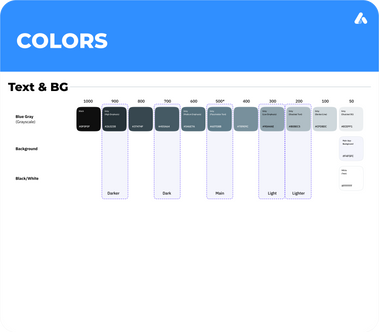
Symptom Checker design system is structurally based on Bootstraps 5. It is because this project was designed ahead of its plan and we don't have enough workforce to implement it. So, Bootstrap design system was a flexible option to cove with multiple uncertainties and the project finally was implemented by a small outsource. Nonetheless, most of components are newly customised to significantly match with the application to build up the app branding.
Chief Complaints


Symptom Checker is designed with a body map to help users understand what your medical symptoms could mean. According to information architecture, A body map can be classified into 12 sub groups based on area and organ system including all body, head, ears, eyes, neck, respiratory system, heart, back, Gastrointestinal system, Genitourinary system, hands and legs. Also, when users select on a particular chief complaint, synonyms of its symptom will be provided as options where some regions and areas might call the symptom in different ways.

Symptom Checklist


The checklist is the most important key module of Symptom Checker. They are multiple modules which contains computerised algorithms and scoring behind each checkbox. When users select either checkboxes or dropdown, a total scoring will be calculated to return users a result of disease likelihood.
Result


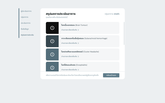
The review and confirmation page allows user the last chance to edit and change their answer before the calculation. After they confirm their answers, symptom checker algorithm shows you a raking result of diseases based on a likelihood and more information about the disease. However, this tool does not provide you a medical treatment. This symptom checker is intended for informational purposes only. For a clinical treatment, we recommend users to access a health service authorities to get an appropriate care.
Usability Testing & Results


The first phase of our Symptom Checker project has been a resounding success, with a solid user flow and positive feedback from our usability testing. The flow, starting from the personal information page and ending on the result page, was intuitive for the majority of our users, with 80% successfully completing the tasks we assigned.
To further validate the user experience, we conducted an A/B test to gauge their perception of the results page. The results showed a preference for pie charts over color intensity rankings, as they perceived the charts to be a better representation of the likelihood of a specific disease. After reviewing the results with our stakeholders and medical team, we decided to combine both approaches by incorporating the color intensity into the pie charts, resulting in a final version of the results page that is both informative and aesthetically pleasing.


The team also conducted further validation on the "alert trigger" feature, which will serve as a warning signal for users on the severity of their symptoms at the end of the result page. Through user testing, it was discovered that participants were more inclined to read the results with red alert triggers first, even if they were not ranked at the top. This was due to the red color being associated with a higher risk of disease. This finding aligns with the medical team's goal of prioritizing the focus on high-risk diseases, regardless of their likelihood being low.


